Directory

Tuesday, December 29, 2009

Recent Works

I haven't been really doing my big Van Gogh portrait lately. I've been busy, also procrastinating, and I have to find the right way to really portray Vincent's face how I would like to.

Although, this doesn't mean that I've not been doing art. I have been doing a lot of art things lately--if you haven't noticed the new header graphic and snazzy new link-buttons! If you don't remember, or haven't been here before, the three-panel scene of the mountains were freshly installed early this morning (around 1:30 am).

This also included the buttons on my other blog, Seattle Whispers. You know, I'm just gonna put them here anyway.


I knew I wanted something to jazz up my blogs, and I decided personalized buttons is a good (relatively easy) first step. I tweaked around a bit on what I wanted them to look like, and then used GIMP [free version of Adobe Photoshop] and my Genius tablet to create them.

If enough people are interested in the steps (and ask me or show interest), I will put up a blog for the blow-by-blow and techniques I used. Show interest by commenting here or emailing. Or asking me if you know me.

--------------------------

For the three-panel-buttons you see above, I created a single image with black bars where I was going to crop, and then saved each cropped version as its own file. So, I had essentially my Full Image, then Crop 1, Crop 2, Crop 3. Getting them in this order, all lined up with no spaces was a little harder.

Essentially, it all came down to how I uploaded each image, tweaking the border-pixel size, and a little bit of frustration. At first I loaded them to be aligned as to the left, center, and to the right. When all three images were up, there was a lot of space. To cut a long story short (and if you're trying to do something similar like this), when uploading the images, select the alignment value "None." This allows you to stack them together like above.

---------------------------

My very latest art piece might be the hardest to spot: The picture on my "About Me" link. Yeah, its digital now.

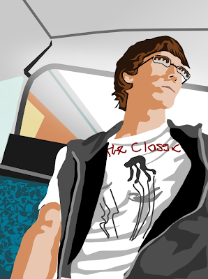


Nothing too flashy or complicated on this one. I just took the JPEG image, and plugged it into Inkscape [a free vector-imaging* program] where I then essentially traced outlines** of the jacket and my face. Almost everything else was freehand and referenced instead of traced outright.

Alright, hopefully that satisfies a few peoples' appetites for at least a few days. I know it's been lacking, but I'm trying to update more often.

Happy New Year (!) if I don't write again before Thursday.


------------
* - Vector images use different algorithms to store and show curved lines. Bitmaps (like JPEGs, etc.) use squares to show curves. Vectors use real, mathematical curves.

** - This technique is called 'rotoscoping'. Traditionally, animators would trace shapes from real-life film so they could draw movements that looked real (Like for Snow White and the original Star Wars trilogy). The technique still survives in some form today.


Thursday, November 12, 2009

Second Five Hours

For anyone just finding this post, this is the second in a series that is cataloging my progress with my new, multi-mixed media portrait of Vincent Willem Van Gogh.

More info on my new project--start here for intro.

One thing to start with, as I left it out my last post: The reason I chose Van Gogh. After I found this whole new source of materials for color and texture (the hole-punched dots), I decided to make a portrait of an artist that used pointillism. Apart from George-Pierre Seurat, Paul Signac, and Henri-Edmond Cross, there was Van Gogh.

It might've been biased to pick Van Gogh for being one of my favorite painters (or the fact he's like my great-great-granduncle), but I decided to tribute this project to him.


SO...

Since my last post, I've worked another five hours on this project. Slowly but surely I'll get there. I noticed that I had killed off all of my blue dots, so I had to punch some more, and start working on other parts of the portrait. I went through my pile of exhibit art cards, pamphlets, and other colored paper, and found a really nice dark green-gray card.

I started punching for an hour or so, and had a lot of dots that I divided into darker and lighter piles to mimic light--the dark green was going to be Van Gogh's jacket.

When I began gluing the dots down, I noticed there was a size difference in the dots I have. The majority of my dots have been taken from an office hole-punch, but now I was using a home one. The home-made dots were just barely smaller than all the others. I didn't think anything of it, and just spaced them differently.

This ended up being my big mistake. As I set up the portrait and stepped back (on top of a chair), I noticed the white spaces were over powering the colors. I realized my mistake, and went to bed in a bad mood (as it was like 2:30 am).

The next morning, I was relieved to find out that it takes 64 home-made dots to fill in a square, rather than 49 of the office dots. I was so worried I'd have to spend a lot more time finessing the white spaces between dots.

After cutting a new sheet of dots (of the same colors), I jumped back to work. Here are the finished results--old, messed up dots on the left; new dots on right. It might not seem like much, but it really kicks the colors out of whack the old way.


Now that there's a new amount of dots for the future squares, I will have to note which squares have more, and add all the dots that way. So far, after 10 hours of work, I have 1,070 dots on 20 completed squares--and I still have 44 more squares to go!

I also decided that I should have more than just a gridded picture to compose the portrait. I also need a color-guide. I quickly drew up and colored a reference photo of what I'm envisioning for this portrait.

-Enjoy!

Monday, November 9, 2009

Peak @ New Project!

Here is yet another sneak peak of a project. Unlike the obscure glass project--of which I don't have any true, solid goal for--this one is planned out and set.

A month or so ago, I was working in the office at the local Museum, and went to empty the three-hole punch of the paper dots. When I opened it, I saw a brilliant collection of perfect, colorful disks. With almost no thought, I grabbed a plastic bag, and emptied the dots into it.

Right then, I knew I was going to use them in an art project at some point. I went around the office, dumping the other hole-punches. At home I started a collection box, as well as gather materials to punch colors from at home.

Now, I have a stack of fliers, pamphlets, and art cards that I rescued from being recycled and thrown away--all so I can recover unique colors for future projects. Below is an example of how they will be used.

For the next few weeks (or however long it takes for this first project), I will update this blog on how far along I am--links below.

-Enjoy!

------
5-hours
10-hours

First 5 hours

More info on my new project--start here for intro.

Earlier this year, I did a series of portraits (at first it was one a week), and each one was to push my limits as an artist. I tried new mediums, as well as techniques, expanding my repertoire. A lot of these didn't end up how I liked, but were excellent teaching/training experiences.

I highly suggest checking them out, starting with the beginning.

Now, I'm picking up my portraits once again. Newly inspired by awesome artist Phil Hansen (now on YouTube), I am jumping back to the square and grid techniques from before.

Using punched paper dots (most notably found in office hole-punches), I am creating a portrait of the famous painter Vincent Willem Van Gogh.

I originally set out to just take one of his own self portraits, and grid that out. I opened up one of my large volumes on Van Gogh, and realized the prints in the book were pretty big anyways. Instead, I decided to use those as references, and sketch my own Van Gogh. Above are the attempts, and ultimately the one I ran with.

The gridded version above is 8'h x 8'w, and I stuck with my usual x2 conversion. So, the finished piece will be 16'h x 16'w. I lined out about a dozen, 2-inch square pieces of thicker paper to use. then grabbed my bags of paper-dots, and went to work.

I've calculated there will be 64 paper squares, and each fit exactly (fortunately) 7 dots in both dimensions--49 per square. So, this portrait will have 3,136 dots on it.

In the last two days, I've worked five hours total on this project. This includes the prep-work of sketching references, gridding papers, and planning out colors. I am expecting many more hours, as my paper-dot collection is shrinking (mostly blues), and I have to punch new ones.

I'm excited about this project, and will keep updates coming along every couple of work-hours. Below is the progress thus far after 5 hours.

Link to next five hours.


Monday, October 19, 2009

Sliver of a Peek

Been working and experimenting on a new art form and project. At the moment not exactly sure where I'm going with it (or it's going with me), but it's been interesting to say the least. I'm kind of picking up inspiration and steam as I go. The process also excites the young curious artist/scientist within me, and I marvel. Hopefully I can snowball everything into a collective series, or a loosely-based theme in some way. Either way, we shall see!

Officially, I'm dubbing the "under-wraps" title as Project Ice (or Verkefnið ís, which is Icelandic)

Here are some tantalizing hints into what is involved. Enjoy!


Insight into the process behind Project Ice,
as well as a look at my handwriting--as odd and unique it is.


Hints at something even more substantial, and all the more
unreal and borderline fragmented abstraction.

Thursday, October 15, 2009

Tattoo Design, Part 3

After a few weeks later than expected, one of my tattoo designs has been inked--sort of.

The commissioner of my last tattoo design, Marshall Brooks, went in to Good Vibes Body Art to get the design looked at. From there, awesome tattoo artist, Ben Turpin took it, and just ran with it. I've only been doing this a little while, so Ben cleaned up and simplified the wing design. His amazing gallery of work can be accessed here.

Here's a comparison of the line art on my end, and the complete awesome on Ben's:


By the way, the photos of the tattoo and process
are by Rachel Powell. Enjoy!
To see the process behind the design--well, you know.


Wednesday, October 7, 2009

MUTEMATH Concert

I had an excellent time seeing Mutemath live at the Showbox @ the Market. The blogs I posted about it overview the night's events, but were also more personal. They ended up being posted at Seattle Whispers, so I'll just link from here.

Enjoy the posts, and video clips are on the way!