Directory

Thursday, January 28, 2010

Vectors!

Okay, I am going to run a little experiment. Basically, here's what I'm going to be doing for other people if they donate some $.


-------
From real picture, to vector graphic


Now, because this process is more technical than creative (unless the commission is to add certain features, colors, etc.), I don't expect to get much money each donation. Like probably a minimum of $5, just because it takes time for each one.

If you are interested, please send me an email with the Headline being "Vector Commission." Also, attach the picture you would like for me to vector--nothing too big, just so its easy to load, etc.

I don't want to be vectoring anything that's overly graphic in nudity or violence, go ask for that somewhere else.

Also, please note that every month I will be posting thumbnails of all the vectors for each month to showcase. By default, each thumbnail will not be able to be enlarged, unless you give permission to.

That's Cute...

Just recently rediscovered my friends' band they have on MySpace. It's not a true band, like a band-band, they remix different songs together. I still like it, anyway. I thought I'd share their music and the image.

The other night I was bored, creative, and had my computer. So I got cracking, and whipped out a playful little vector image for them. After I emailed it to them, they happily used the graphic.

Their band is called That's Cute, I Remember My First Remix (with corresponding MySpace link). By the way, my favorite song is My Drinking Team Has a Dancing Problem...and possibly Boner Jams.

Also, their other mock-band, Whores Behind Doors has some snazzy music! I may make a graphic for that one as well.

The graphic was created on Inkscape (vector-graphics), my Genius tablet, and insomnia.


-Enjoy!

Thursday, January 21, 2010

Pea Graphic

I'm behind, but last week there was an illustration that I had done that was published with an article about peas. The farmers of Skagit Valley will have to do without planting peas, which is an important crop in the field cycles.

Anyway, it's a big story, and I will only be talking about the graphic I've done. I wanted to have this out at the same time as the newspaper featured the graphic, but like I said, I was behind.

At the end of last year, I went to pick up my check when my editor asked if I wanted to take on an illustration for an upcoming article about peas. She told me she wanted a picture of a bag of peas, and an open--possibly empty--can of peas.

I immediately started sketching the design and wrote some notes. She then gave me some money, and I bought a bag of peas and one can.


I went home knowing exactly how I wanted to do this: take several pictures with the can in different positions, and later edit them on my computer so it is one image with three cans.

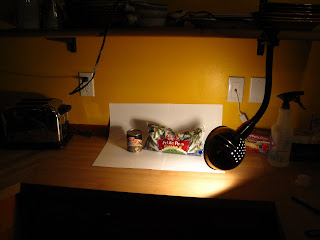
At home, I grabbed big pieces of paper, tape, my camera, the peas, and a clamp-on light. I had an impromptu studio in the kitchen.


I arranged the cans as needed, and took a series of photos at different angles. I also changed the lighting quite a few times. Here are the different pictures that made it.


The tea box was the exact height of the particular can I used.


The final garnishing.


On the computer, I used my tablet and GIMP, and probably about 3 hours or so layering, shading, burning, editing, etc. The sign with "Sold Out!?" on it was eventually erased for the paper.


Wednesday, January 13, 2010

More Acrylics

Yesterday was a slower day than I anticipated, so I started playing around with acrylics again. Instead of using another (and last) of my thin, 5" x 7" canvases, I decided to test the mounted 8" x 10" canvas.

I again documented the process, and yet again I feel like I took it too far. Oh well. Part of the beauty and challenge of art is to know when to quit, and how to still make it work if you've gone too far with a piece.


I really started out being very inspired by Philip Govedare's work. I saw it frequently the last few months at the local art museum.


I also really liked the soft, watercolor tones I had going. It's about here I really should've stopped and at least taken a break.


This isn't so bad now that I look at it, but at the time I wasn't feeling it. And this was more of a free-range experiment, so I went with what I felt like. So I blacked everything out and started anew.


Even though there was something bright and lovely beneath, this started to turn out better in my mind. You can just see the vestiges of the orange "clouds" peeking through.


Played with adding black on the edges. Hardly noticeable. . The blue is very playful and energetic.


Liked the lighting effect from the window. It had been cloudy all day, and the sun had just started setting.


Nebula
Acrylic on 8" x 10" canvas
January 12, 2010
Alexander Kramer

Link to my DeviantArt (and print-order-able version)


Materials
Artist's Loft acrylics, 12 colors
Newspaper
Canvas
Plastic knife
Paperclip
Napkins/Paper towels
Water (and dish)
Loew-Cornell brushes - Hair and nylon
Imagination/boredom/time

Thursday, January 7, 2010

Acrylic Experiment II

I sat down today, and decided to experiment with the acrylics once again. This time though, alone, armed with music, and a camera.

I have documented most of the changes during the process below. The final piece is at the end.


Flipped over the canvas for new angle and kept it.


Now that I see the image above, I almost feel like it really needed this space. Oh well, learn for next time.


Cosmos
Acrylic on 5" x 7" canvas
January 7, 2010
Alexander Kramer

To buy the print version of this, check out my DeviantArt page.

I'm starting to get a hang of painting and finding my style.

Materials:
Artist's Loft acrylics, 12 colors
Newspaper
Canvas
Plastic knife
Napkins/Paper towels
Water (and dish)
Loew-Cornell brushes - Hair and nylon
Imagination/boredom/time

Acrylic Experiment

I recently wanted to try experimenting with painting. So I stopped by Michael's to pick up some cheap supplies. There was a good deal on medium sized canvases, as well as little, thin boards to test on.

Yesterday, I broke out the little set of acrylics, and just started playing around. Because acrylics dry quickly, I was able to just keep adding more and more layers, slowly morphing the image or completely painting over it. I should've had a camera on hand--I didn't think about it, but now I wish I had documented the slow process of the morph. (See notes below if interested)

After a bit, my girlfriend Myca came over. We started passing the brush between us, slowly adding our own layer or color--whatever caught our fancy. One thing that had a cool effect was adding water and wiping away colors/layers.

There was a point where it looked completely like crap, but it was somehow salvaged:


Untitled--As of Now
Acrylic and ink on 5" x 7" canvas
January 5, 2010
Alexander Kramer

Note: Birds added with ink later. Highlights on trees is canvas once the paint is removed (by paperclip). Darker lines of trees are also ink.


Myca says it would look awesome as a t-shirt design. You can visit my DeviantArt to buy a print.


I really like the "towers", and how they look distant, as well as the range of colors at the end. Lots of "pure" colors peek through in weird places as well. Also, those black towers ended up being very messy.


Another Note:
The (very) rough process of what happened, for those curious. Man, I Really should've taken pictures!

*Blank (Horizontal)
*Hill with lots of trees and blue sky
*Water added to foreground
*Orange "pillars" added around hill and trees (flames?)
*Water tinged yellow-ish. Yellow added to pillars
*Dark red-purple wash over water. Added to pilars.
*(Vertical) Brown mass added, looked like tree exploding when horizontal.
*Smudging of colors, very dark and mottled
*Water drops to take away paint, looks like person (ink added to face)
*Water drops to super-smudge
*Pure paint added to canvas and smudged with knife
*Knife scratches look like feathers
*Parts whited out
*Eventually green vines
*Yellow petals
*Slashes of bright colors, like waves
*Water used to erase layers, exposing colors
*Big black space, edges diluted with water to create fade
*Dampening with paper towels, excess, diluted paint lifted
*Ink and  highlights
*Oggling
*Blogging