I've been super busy this quarter. I've still been creating and sketching, and just got done with a bigger project (as well as started two others), but here's a little taste of what I've been up to.
The finished project I won't be able to show until it drops.
Here's a hint.
I've messed around with stencils a little bit.
Had some printer stickers, so I created a stencil and transferred it to the sticker, then my notebook.
My friend asked for a tattoo design. Most times I just straight out say no because whoever is asking usually just wants me to draw a generic bird or tree because I'm artistic. I tell them the tattoo artist can do that. Occasionally though, my friends will ask for a specific, Alex Kramer original. This time my friend asked for
Mjolnir (Thor's hammer) that would go on her wrist or ankle, so it had to be small,
and she didn't want it to look like every other
Mjolnir tattoo.
My friend's initials, LKC, make up the shape of the hammer. I think the color and flow really fits with the Norse theme. I sketched a rough version in GIMP, and then drew this version entirely in Inkscape with the other as a reference. I love how precise you can get this way.
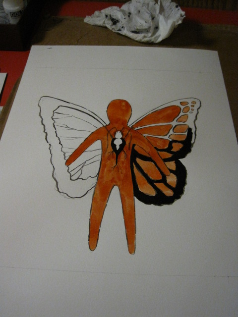
Tonight I decided to stay up (since I have
nothing planned for tomorrow--no finals) and ended up getting started on a piece I've been thinking about for a while. The following pictures are the work in progress inspired by my Ancient Greek literature class, after hearing the myth of Prometheus creating humans from mud dolls and butterflies. This is the image that's been in my mind all quarter.
After completing a sketch on a smaller sheet, I grabbed this watercolor paper and lightly sketched the drawing and boundary lines.
Inked the pencil lines with a 50/50 ink and water mix to get more definition. Then used watered down acrylic mixes as watercolor paints. Here I was filling in the wing with non-watered black acrylic.
Added a darker layer on the mud doll, as well as acrylic-ed the opposite wing. Notice that the wings are different.
Bam, color! I got so into the mixing of colors and blending that I forgot to step back and catalog the process better. I'm still not sure what will happen with the background, but this isn't done yet.
Some macros for detail:
You can see where the 50/50 watered down ink still shows along the wings. I liked the texture and look of it, so I kept it partially revealed.
More to come.