Directory

Sunday, June 20, 2010

MoNA Art Auction

This weekend, I had a piece in the Museum of Northwest Art's annual art auction. This auction is said to be the best exposure new artists can get, and for free. This single event draws thousands of tourists and art lovers from all over the state (and Northwest), but of course a majority hails from Seattle.

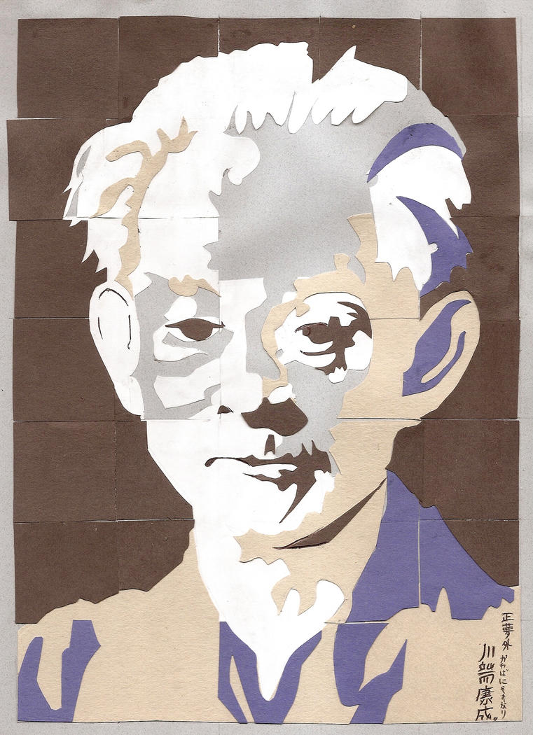
Last year I entered a portrait as kind of a "why not?" and it ended up selling. Actually, I spoke with the winning bidder, and she said she was at a restaurant looking at the catalog, and knew she wanted my piece, even by the thumbnail. By the way, last year's submission was this one:

 On the deviantArt page for this, you can read the background story and materials used.


This year, I initially wanted to do another portrait, but to no avail. And then, I was suddenly hooked on the idea of drawing my town, from street view. If you're intrigued, and want to know the background info, you can read it for yourself here.

Anyway, the last I saw of my piece was about three or so weeks ago when I submitted it to the Museum to get framed. It was in three pieces, all disjointed and incoherent...and on Friday night, during the Preview Party, this is what I saw:


I absolutely love how it came out, and the matting is just perfect. A lot of people at the auction were congratulating on my piece, and how much they liked it. The majority of the pieces in this auction are in silent auction sections, and so there isn't as much energy as the main event: the live auction.

Of course, there's still a buzz in the air, and people are continuously flowing in and out of the sections and ebbing in and out of the upstairs section. It's always nice to see so many people interested in art all in one place, and for artists to get recognized and mingle with possible-buyers and appreciators.

Once the silent auctions were finished, I was pulled aside by a few people of note in the community, and they expressed their approval on my piece, and wanted to know if I wanted to collaborate on a future project. I'm excited.


Also of note, while browsing the galleries during the auction, I came upon artist Tom Beckwith's piece. All I have is this little thumbnail from the Museum's auction site.

When I first started my street-view project, I had a few ideas of what I wanted it to look like. One of them looked kind of like this:

Monday, June 7, 2010

Art Recommendations

To fill in some time and space before my next post, here are some of my art-related recommendations:


Artists to look for:
[I claim no rights to the artwork, the thumbnails are to show-off the skills of the respective artists.]


 Eric is a crazy-awesome comic book artist that has a unique way of drawing characters. He tends to exaggerate aspects of an image to bring out more movement or emotion. He lives in California, in or around Los Angeles.


 Alex is a successful and very talented graphic artist who has collaborated with bands such as The Used, Cage, and In Flames for album-related graphics. He lives in Cali, San Fransisco Bay area.


Irish artist I stumbled upon one day, and have been hooked on ever since. He is very eco-conscious, and paints on cardboard and recycles materials a lot. He even found a use for cups full of paint-tinged water: stain paper with them for future works. He also gives great art recommendations.


Tran (pronounced Tron) I found through a recommendation by Barry Quinn. She is a young and flourishing Georgia (US) artist. Very ethereal work.


Myca Gilkey

Washington artist who plays around with photography once and a while. Recently, she's expanded into other realms of art, including painting and drawing.


Gretchen is a Seattle-based artist. Her work is inspired by urban and natural environments. She creates pieces out of stickers she finds all over the city. To give back to this community, she has creates a few of her own stickers.


Kai is a very awesome artist I found on DeviantArt. He's done artwork for games, trading cards, and the works. We got talking when Avatar came out, and also about a zombie story I was somewhat writing.


Art Supplies I tend to favor:
[I am not being paid to advertise the products, these are merely what I have found to work for me]

Higgins India Ink
Pilot pen, Precise V5 (extra fine)
Ticonderoga pencils
Sharpie markers
Faber-Castell markers
Golden liquid acrylic paint
White nylon erasers
GIMP (editing/drawing program)
Genius Tablet

Art Event(s):


If you live within or within driving distance of the Skagit Valley, WA, come over for a weekend for the Museum of Northwest Art's 18th Annual Art Auction--June 18-19.

 Crane Guarding Pine by Curt McCauley

You can check out the Museum's page on the auction here. Images of this year's work, as well as contact info for tickets and places to stay are listed.


Monday, May 31, 2010

Street-View Project

Okay, so I've been really, really slacking on updating all of my blogs consistently. Especially this one, as I wanted to post the process of one of my pieces (entitled East Meets West), as it was happening.

Now, the piece is completed and getting framed, so I guess I'll have to dump the whole process on here--and most likely post finished-and-framed pictures at a later time--like when I get to see it finished.

You can chase this link to the backstory and inspiration of this piece. This post would've been really, really long, and the photos would've been way at the bottom--boring. I suggest reading the backstory if you are confused on what I was trying to draw/convey.

This piece was designed and created for the Museum of Northwest Art's 18th Annual Art Auction. Originally, I was planning to use a portrait of some type for this, but ended up puttering out mid-project.

My initial idea was to use really long sheets of paper to show long stretches of buildings from street-view, like rolls of receipt paper, which are 3-inches tall, and can be more than 120-feet long. When I pitched this idea to the Director of the local Museum of Northwest Art, he thought a heavier watercolor paper would be more appropriate, as well as adding color--my idea was using black ink, graphite, and some red.

Once I had all of my materials together (which I will list later), I went to work.

Sketching/Planning
Using rulers and straight-edges, I drew out the panels to be used. I then referenced lots of live sketches from weeks before, and put down light sketches of the buildings on three panels--I couldn't get a piece that long.


I started with really big pieces of heavy-duty watercolor paper. Because I was going to use washes of acrylic paint later (really watered down like watercolors), I gave myself a 2-inch. margin, and laid down painter's tape to help prevent buckling/warping. In hindsight, this ended up barely taking off the surface of the paper, and I know not to do it on this type of paper anymore. I'll just be more careful with my paints.

Inking
Using watered down India ink, and various calligraphy nibs, I inked out the buildings and lines I wanted to keep. Because the ink was so watered down, it was real faint so any mistakes would be easy to remove or cover up. The inked lines I liked were darkened later.


For windows and doors, I used masking fluid to confine the ink to only those areas. Once the ink was dried, I erased all other graphite lines, as well as the dried masking fluid using gum-block erasers. Using more watered down ink, and wider calligraphy nibs, I darkened large patches of shadows--like beneath awnings or down alleys.

Painting

I started painting with light washes of acrylic. In the past I have played around with tube acrylics, which are thicker than the liquid acrylics I used in this project. I mixed small amounts of water with even smaller amounts of paint--it goes a long way, and I can always add more of both if needed.

The paint was applied with nylon brushes of various sizes, because the fibers are less likely to fall into the paint than with natural brushes. (Seriously, naturals are for real watercolors, not plastic paints). At first I had difficulty keeping the paint thin on the paper, but eventually got used to it.

I was continuously switching between the three panels because I'd have too much paint mixed for just one detail or building on one sheet. To keep the panels protected from spills and cats, I used painter's tape to stick them to the wall--I had no uncluttered, level space that size on the table.


Smaller details, like the lettering on the sign above, was still acrylic, but applied with nibs rather than a brush. Also in this pic, you can see the labels I added on. Just to illustrate the abstract-idea of this piece, look at the light post and the fence. These two things are across the street from each other in reality--in fact, you can see the labels below say East and West to "show" the opposite sides of the street.


In the pic directly above you can see the other "jump" across the street. In reality, these are again across the street from each other, and there is a large parking "between" them.

Photos of the full piece will be added soon, and will most likely be on a separate post.

Enjoy the extras:

List of Materials

* Sketching/Planning
  • Pencils
  • Rulers
  • Straight-edges
  • Painter's tape
  • Watercolor paper
  • X-Acto knife
  • Table

* Inking

 * Painting
  • Watered down acrylic (Golden brand)
  • Nylon brushes of various sizes
  • Paper towels
  • Painter's knife
  • Calligraphy pen and various nibs
  • Masking fluid
  • Painter's tape 
  • Patience
If you are still confused on what's happening, here are some screen-caps from the Bird's eye on Bing maps, with colors showing each panel.


Street-View Project: Backstory

Here is what inspired me to start and complete my most-recent piece, East Meets West. 

I've been reading the amazing BLDGBLOG ever since I found it on my computer one day. (Seriously, I must've found it at 2 a.m. one morning, gone to bed, and left it on the screen for my awake-self to find it). The blog deals with architecture, buildings, and the various forms of creativity linked to the planning and construction of such structures. I've never been one to admire buildings (except the monumental/grandiose ones), but I have found a new appreciation for them by this blog--and gotten hooked--I've spent many late-nights/early-mornings digging through/reading older posts. I suggest you take a look, and it might just snatch you up.

Late last year I started salvaging a lot of paper and art-related (or possibly art-related) materials from my various work places. This was influenced by an exhibit I saw earlier in the year: Finds Refined at the Museum of Northwest Art (MoNA); meeting the Seattle artist Gretchen Bennett (from the MoNA's show); as well as my finding the Irish artist, Barry Quinn, who is very, very eco-conscious.

Some things I started salvaging included: the dots from hole-punches, sheets of colored paper, scrap paper for collages, the cardboard CD holders from audiobooks (the library uses plastic and throws out the cardboard ones), as well as the receipt rolls from our ticket-printer. The rolls of receipt-paper hooked my attention, because you can draw really long murals, sketches, or landscapes on these. Coupled with the BLDGBLOG-driven mind set, I wanted to draw a long street-view of buildings all in a row.


Now, this may sound a little boring, but in my mind I was going to twist it: I'd draw cables (from anything electric) in red, and the majority of the buildings in black ink or graphite. Also, I'd disregard the actual streets and corners, so buildings across the street from each other in real life would be right next to each other, or buildings would look really long if I decided to follow them around the corner.

Here is a good example of this idea (and actually in my targeted town), photographed by Joe Mabel, and posted on Wikipedia. The Swinomish Channel is straight, but in this photo it looks like it curves.


My initial idea was to do the whole town that I live in, but when I started doing live sketches of the buildings downtown, I knew this would be nearly-impossible, even on a 125-foot long roll of 3-inch wide paper. So, I decided to start with just a small section of downtown.


When I pitched the idea to the Director of MoNA, he said using the receipt-paper would be really tacky, and wouldn't hold up after a while. Instead, he suggested I use a thicker watercolor paper in large sheets to convey my idea.


So, that's what I did. I am still hooked on this stream-of-thought, and am already planning/sketching alternative takes on this idea.

Saturday, April 3, 2010

Shirts ordered

So, today I visited with a local printing company to see samples of my work on shirts, and order a batch. I'm going to try selling these locally, as my CafePress shop wasn't getting anything. That system is better for higher volume sales than what I have.

Now I'm waiting until next week when the batch makes it in--and already I have three orders on top of my original fifteen.

Here are the three designs available so far. Shoot me an email on here to order shirts.


Saturday, March 20, 2010

Resonating...

Even though I've been having trouble lately staying put on an artistic technique or style, I feel as though everything is resonating and going on a good path.

I keep jumping around with ideas and use of media, everything from painting acrylic on seram wrap to sketching on long, long sheets of paper (think of the paper rolls for older, print-calculators). Other art and artists keep pushing, influencing, and driving this jumpy, subject-to-subject, artistic ADD I am experiencing. And I don't care.

Actually, I care a little bit. I get frustrated at the idea that I can't keep still, yet invigorated at all the fresh ideas streaming through my head. Very conflicting, I know.

The whole resonating thing keeps cycling through, and I can feel it everywhere. It might be sort of influenced by the Museum of Northwest Art's newest exhibit, Resonances: Contemporary Echoes Modern.

Four Northwestern curators (of galleries and art museums) have come together to do an excellent show. Each curator chose an older Northwest artist, and then paired their work with the work of another, present day artist. Some of the pairings were obvious, some subtle, but you can see the works all resonating.

It is this vein of at-one-ness that I feel. Maybe because it's Spring time, and everything is changing? I don't know, but we'll see where it takes me.


If you were curious about what sort of things have been inspiring me, here you are:

Resonances: Contemporary Echoes Modern, new exhibit shown in a local (and well-known) art museum, where I've interned for a while.

Tran Nguyen, who I found through Barry Quinn (see below). She is a young Georgian (US) artist. Her name is pronounced "Tron." Most of her paintings are realistic people, with hints of the ethereal and other-worldly.

Barry Quinn, who I found through DeviantArt. He is an Ireland artist, and I like his progression through characters and green-minded tendencies. He also posts about other awesome artists, so its a great reference.

Every Person In New York (aka Jason Polan), who I found on the Yahoo! mainpage. He is fervently trying to sketch every person in New York City, and has been working on it for two years now. Gotte admire the drive.

Alex Pardee, a Californian graphic designer of awesome shirts, as well as The Used's heart-logo (since redeisgned). You just have to see his art for yourself.

BLDGBLOG, which I have no remembrance of how I stumbled upon it, but have loved it since. A blog pertaining to architecture, and pretty much Everything surrounding and paralleling the field. Very intriguing ideas.

Northwestern weather, you gotta love it. If you don't, then wait a bit.

Tuesday, March 9, 2010

Frog Hospital Shirts

My friend, Fred Owens: local coffee-shop personality, blogger, have-funner, historian, and contemporary commentator (I think that's redundant with blogger), asked me to design a graphic for his shirts he's selling.

The shirts were for his blog, Frog Hospital, and he told me what he wanted.

"A frog. But nothing about hospital. Some years ago a woman created a frog with crutches for me, but it didn't look right," he told me over coffee. "Also, green and blue, like the Seattle Seahawks."

After talking ideas some more, I got to work. A week or so later I sent him a few sketches of frogs and styles so he could choose from them.

He liked the variety, and I told him once he chose a frog look I could clean it up and make it look better. He ended up sending a cropped version of the big, blue one in the center to the printer and ordered shirts. (My money was on the little buy next to Big Blue).

Now you can buy them from him, or order them from his blog. I'm going to be doing a redesign to a more logo-looking graphic this time around. Maybe I can make something as awesome as this!

I'll post links and all that good stuff when the reboot version is up and hopping.